This Wright map shows student ability on the x-axis with a histogram showing how many students are in each ability band. These are shown as blue dots in the example below. The Wright map also shows questions at the top (green, orange and red squares). The question difficulty uses the same scale as student ability.
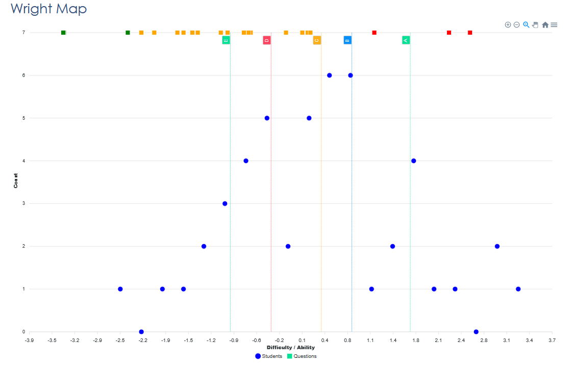
The average ability is at zero on the x-axis. Most students cluster in the middle around this average. The number of students in each “ability band” is typically in a bell curve distribution. A few students sit much higher, indicating strong mastery. The same is true the other end of the scale.
The example above shows several questions appear above most students, meaning those items were more difficult than the cohort’s overall ability. These are coded red to highlight them. In the same way, a few questions fall below most students in the group, suggesting they were too easy and didn’t differentiate adequately.
What this tells the you:
- The hardest questions (red) may need review—were they too complex, poorly worded, or beyond the taught content?
- The easiest questions (green) aren’t helping identify different levels of understanding—consider replacing or revising them.
- Students at the bottom of the ability scale need targeted support, especially around the skills/knowledge tested by mid-level items if they struggled with those
- High-performers might benefit from extension tasks, as they’ve surpassed the difficulty of most questions.
In short: the Wright Map shows exactly where students and questions line up—helping teachers adjust instruction, improve question design, and support every learner more effectively.